
 For my stencil spray magazine cover I decided I'd use Johnny Depp as my cover model. Due to the fact I couldn't take a real picture of him I used a an image from the internet.
After downloading the image and putting it onto Photoshop I first removed the background, and then changed the Image by going to Filter > Artistic > Cutout. This changed the image so that only three different shades of grey would be used, this would allow me to be able to print out the image and cut of the different layers.
 Completely removing the background and some of Johnny shirt I cropped the area in which I wanted to print out, and then printed out each separate layer so that I could start cutting each one out.
 Starting to cut out each separate piece, the black was removed whilst the white was left to reveal different layers of Johnny Depps face. I did this wish the rest of the pieces of paper which I'd printed out, and then from this I started to fix the cut out pieces of paper to a blank piece of paper which the spray paint would eventually have Johnny Depps face sprayed onto.
 Fixing each piece of paper to each other with masking tape and then taping them onto a black board, I went outside and started to spray paint each piece of paper, keeping 30cm of distance between the spray can and the paper so that there would be minimal drips on my actual piece of paper.
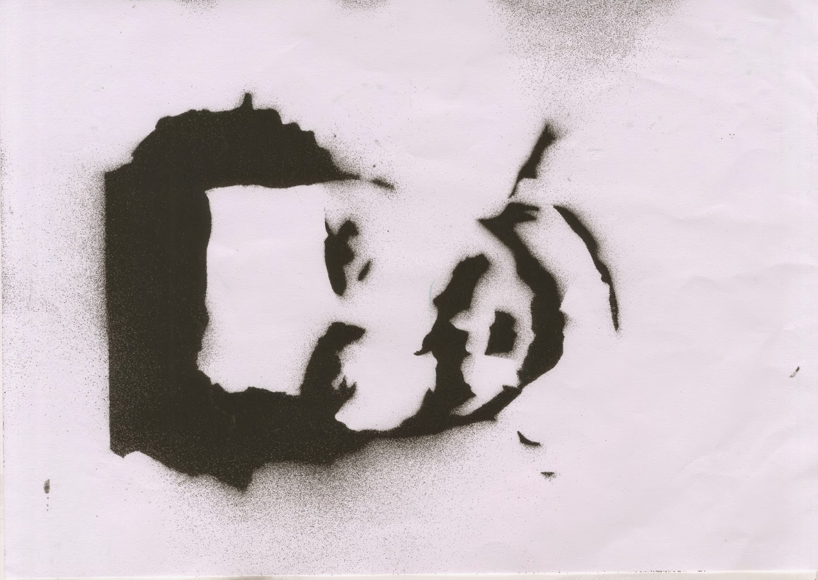
This is the end result of layer 1.

This was the end result of layer 2.
This was the end result of layer 3.
 After finishing spraying each layer I scanned each image into Photoshop and then started to add colour to each image and then merging the layers to get one final image.
  Adding an black layer around the outside of the image so that it gave a sort or border effect it actually allowed me to start adding different text boxes and writing to the magazine cover. Without this border i wouldn't have been able to see the font due to the limited colour scheme I'd chosen. Thinking of a name, and coming up with 'Jet Metal' meaning Black Metal.
After adding smaller titles to the side of the page and showing different bands at the right side, for example Slipknot, and Metallica. I positioned each one specifically so that it wouldn't cover up Johnny's face.

This is the final product.


