21 Oct 2014

Magazine Cover Copy Front Page - Work In Progress and Final Product

Work In Progress
From choosing the cover which I would try and re-create, i then needed to find someone who would pose how i wanted them too, and with the same type of style of clothing and accessories as the woman on the front cover of the magazine I was re-crating. From this I found my model and found the appropriate dressing and accessories which she'd need to wear, upon doing this the photo was taken and I sketched up a copy into my book afterwards.
This is the final sketch which I created as the photograph as a reference. Making sure to add shading in the proper places and making sure that I had copied her facial expression and accessories to the closest possibility I could. After doing this I then needed to replicate the the type face used on the magazine cover, so therefore sketched out and then coloured in the text which was meant to be bold.


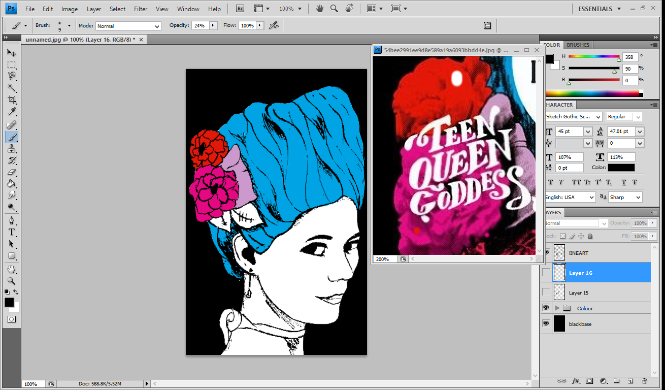
Once I'd completed this I firstly scanned in both sketchbook pages and then loaded the scanned pages into Photoshop. Changing the threshold, and levels of both images I started on the colouring of each part of my sketch. Using the eyedropper tool on Photoshop I copied the colour from the original magazine colour, and then coloured in the appropriate selections on my sketch.
After giving everything a base colour I then added shading and texture in attempt to replicate my chosen magazine front cover as much as possible, moving onto my second file open in Photoshop, once the sketched text looked completely black, I removed the background before putting the selected text onto the drawn cover. Placing the text in its correct position on my copy, I changed it so that it was white, like the magazine cover I was coping and this allowed me to see the now white text against a black background.


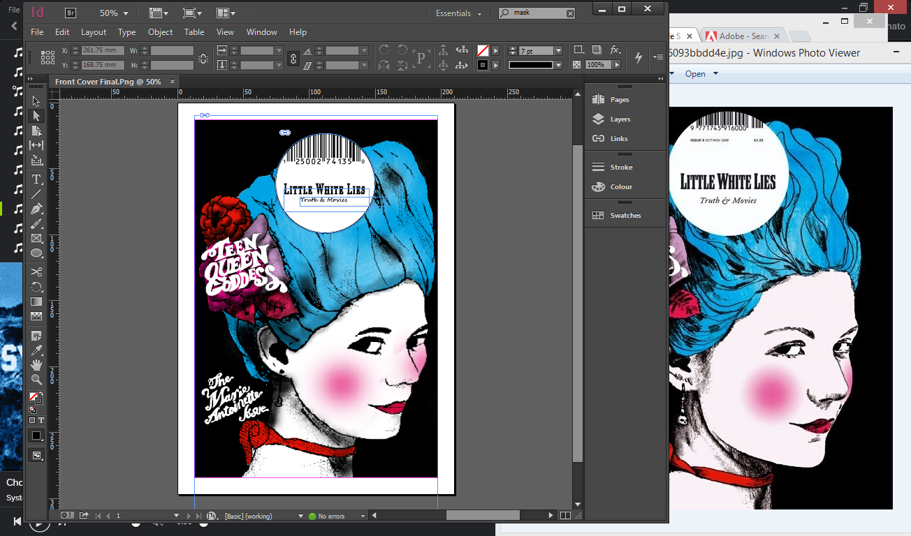
After completing the drawing, I moved the file into InDesign to complete the last part of the task. Putting a large white circle in the centre at the top of the page. I copied the text from the one magazine cover I was replicating to the one which I was making. 

Final Product


20 Oct 2014

Magazine Cover Copy Double Page - Work In Progress and Final Product

This is the double page spread which I'd be trying to copy to the best of my abilities.


Work In Progress

Firstly starting with the black and white pages, I changed one side so that the hues would be correct. Once I'd done this I then started to sketch up some popcorn, which from the double page spread which I copied seemed to have popcorn falling into a pile at the bottom of the page. Therefore doing this I made a rough copy of a popcorn piece and then copied and pasted the piece in multiple places around the page so that it would match my copy as closely as possible.

After finishing the popcorn falling on the right side of the magazine copy I started to copy the text with was placed on the left page. Trying to find a font which matched the original as much as possible, I copied the title 'Art & The Internet' and positioned it, and edited the type so that it matched the original. Once i'd done the major section of text I then started to copy the other text boxes and due to the fact i couldn't see what each word was on the original image I used 'Lorum Ipsum' instead of just typing random characters. Coping the colour of each bit of text as best a I could this ended up being the final version of my magazine Copy.


Final Product

9 Oct 2014

Magazine Copy Cover - Research


For some of my research I decided that instead of only using one source I would use multiple sources to try and get the best effect and best result that I could. Therefore I decided that I would not only use Pinterest but also use Google as a source to find suitable front cover designs to copy.


After searching through Google images for an image I could use I came to the conclusion that I would be able to find one so therefore I decided to do some more research away from the internet. I went out and tried to find suitable shops in which I could take a pictures of displays and pages

After searching on google and not finding anything that I believe I could use I decided that I would also have a look on Pinterest. I put in magazine front pages and found that there was to much to chose from and examples which would be too difficult to make in the time frame which I had been given.

Once I'd searched on Pinterest for about an hour, I came across a type of magazine called Little White Lies, which conveyed and presented many different types of magazines. After searching the different covers of Little White Lies, I chose my favourite design and then pinned them to a board so that I could save the design whilst I did more research.


After searching online for examples of different types of magazine I could re-create I decided that I would not only look online but also have a look in stores at magazines which were available to buy.
Taking a few pictures of some that I found looked effective and would be somewhat easy to make but also rather challenging when it comes to Typeface positioning, and the photograph background


Collecting a few examples which not only I, but others had collect I chose the best pages out the three magazines and then photographed them. These double page spreads present the different types of font which can be used to emphasize background images and different colours.


This is a double page spread which I found which debated on created due to the fact i wouldn't have to take a picture of anything but instead i would be able to draw one side of the double page, just like the front cover which I've decided to create.
After finding a few more examples of different types of magazines with varying styles which i could create as either a double page spread or a front cover.