
6 Feb 2015
21 Jan 2015

13 Jan 2015
My Magazine Double Page - Work In Progress
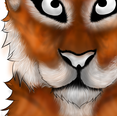
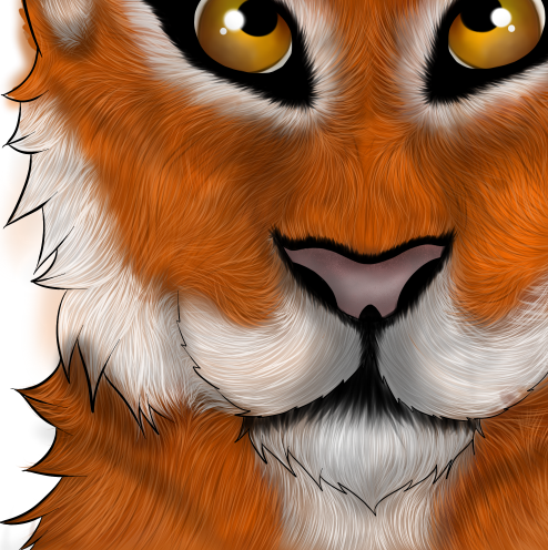
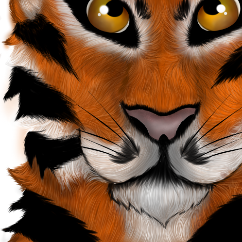
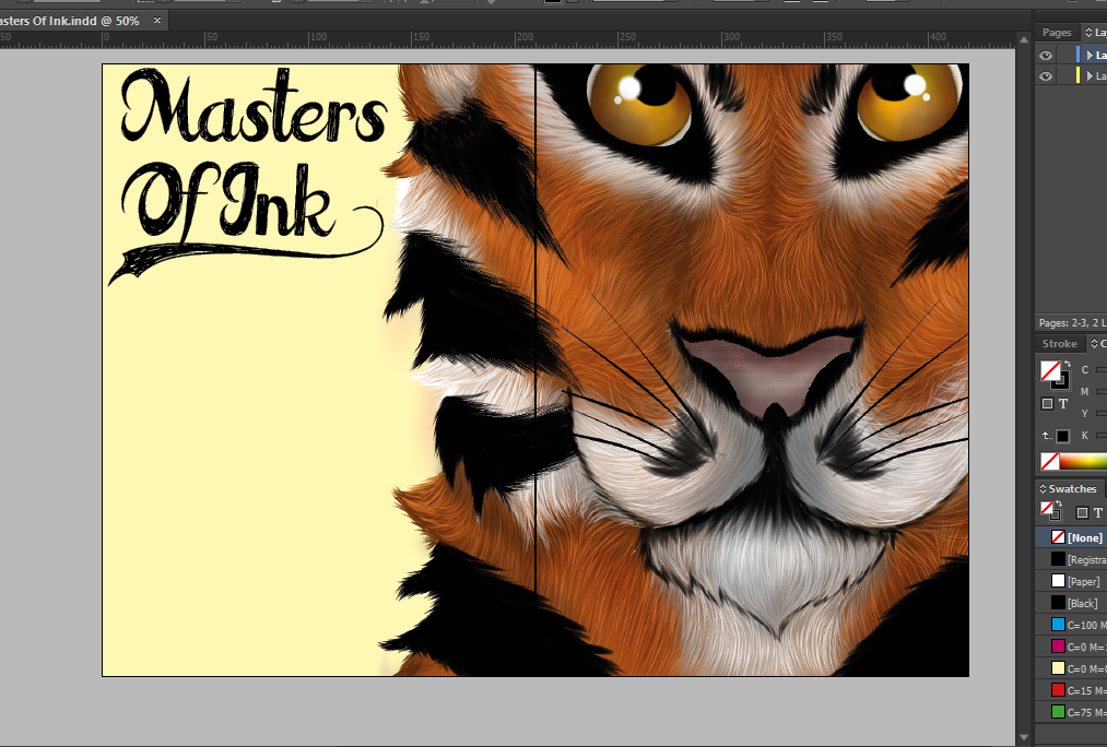
Tiger Face Work In Progress
Below is a time lapse video of the processes I went though to create my tiger design for my double page spread. In total it took around 6 - 7 hours to finish completely.
Below is a time lapse video of the processes I went though to create my tiger design for my double page spread. In total it took around 6 - 7 hours to finish completely.
Brief Explanation
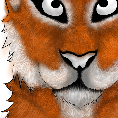
2) Once I'd done the white sections I started on the brown / orange parts of the tiger and started with a darker brown to a lighter brown the same way I drew the white. After this, I started doing the black stripes of fur though the tigers fur, but also added the black accented fur around it's muzzle and eyebrow areas.
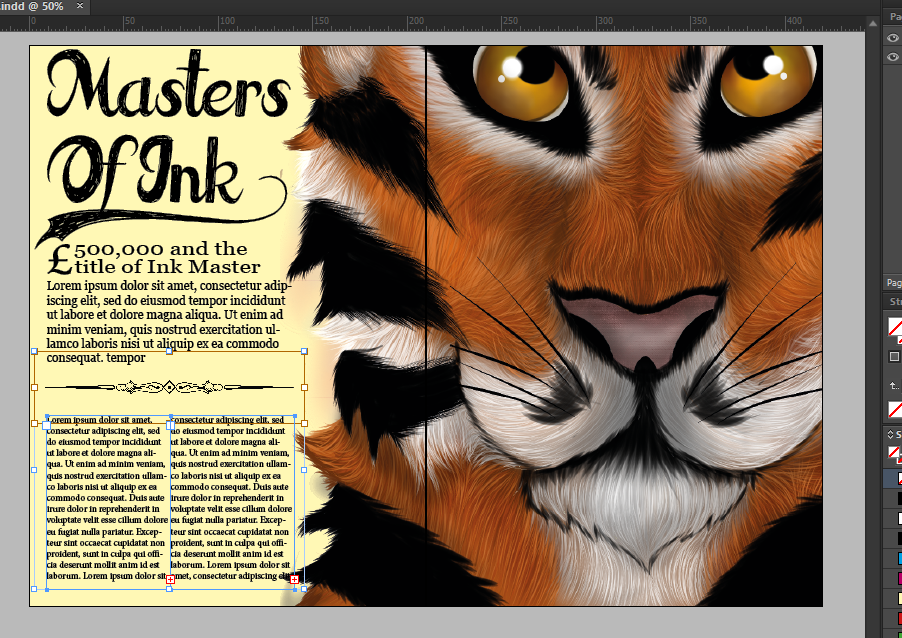
Magazine Work In Progress
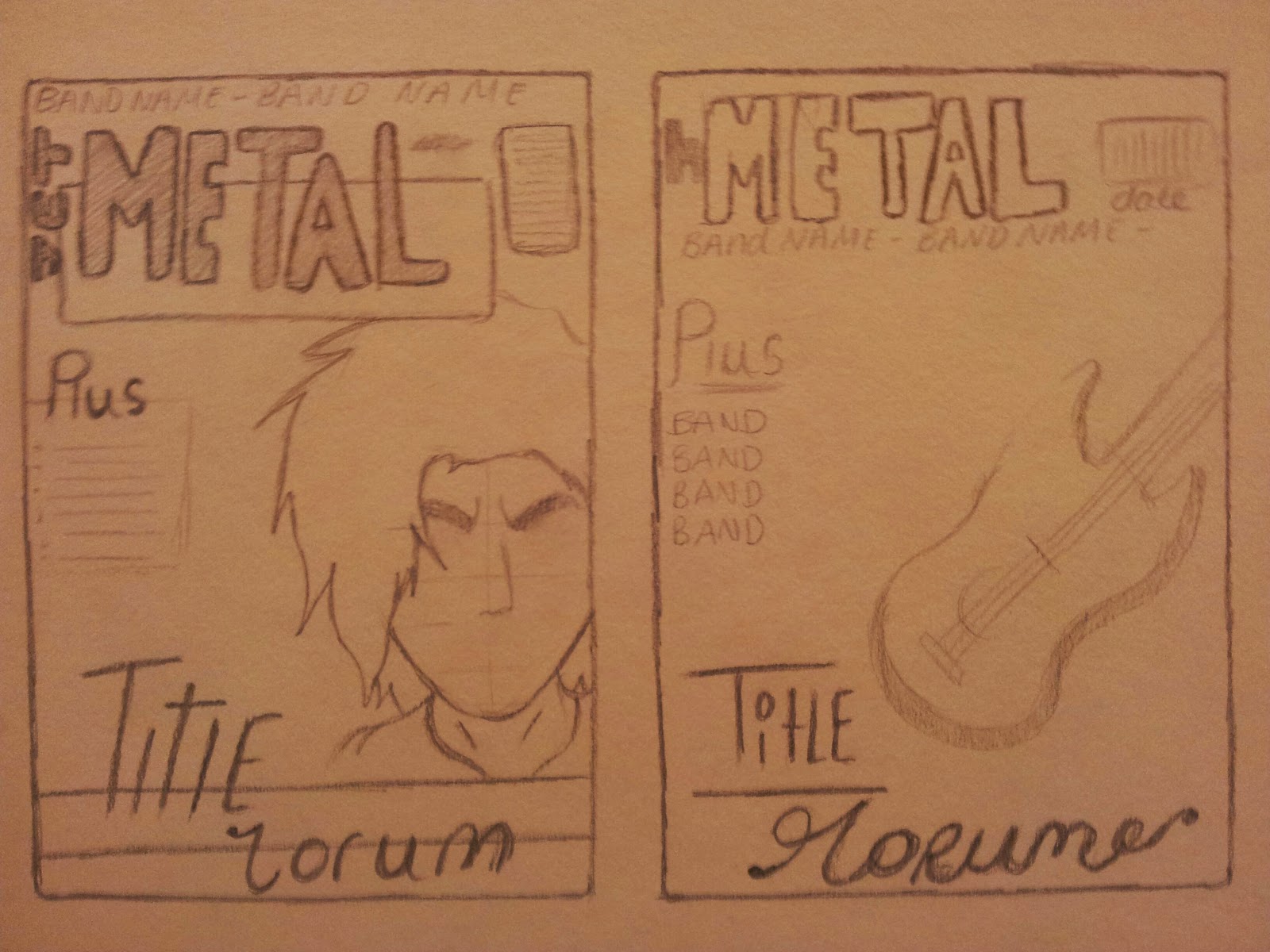
My Magazine Double Page - Sketches


Above are eight sketches of what I may base my final double page spread cover to be on.


These are my final two designs in a lot more detail than my earlier designs.
I have decided to make my final design with the tiger covering half of the page as it will give a much more effective finish than my other designs.
12 Jan 2015
Adjustment Layers Editing
Original

This was the original image which I chose to edit to show that I understand how to edit images in Photoshop properly.
Work In Progress

Firstly I changed the levels in the Image so that it would enhance the different colours in the image, making the light and dark catch your eye and pop, instead of being bland and making the photo uninteresting.

After I'd changed the levels, I then added a colour balance to the image so I could enhance the warm colours in the image and make it so that the yellow and orange colours where more prominent than the others.

After changing the layers and adding a colour balance to the image I added a vibrance and saturation layer to the image so that it would make colours in the image even more prominent along with the levels changed
Final Comparison

5 Jan 2015

My Magazine Front Cover - Work In Progress

Before anything else I chose the best picture from my photo shoot and loaded it into Photoshop. Changing the levels, vibrance and also the colour contrast of the photo, I started to edit the image by making it darker than the original, and also changing the contrast so that my cover models face was paler than already shown.

Heading forth and starting to edit the main features of my cover model, I changed the eye colour from a light green to a pure grey colour. I did this by literally drawing a new eye, changing the already original colours so that the iris was made black and white to block out the colour and then adding more shading and a light source. Not only did I add a light source I also made the whites of my models eyes a lot more white than they were originally. Aiming for a specific effect where the models eyes would pop, and be more prominent than the rest of the surrounding image, I hoped that once the effects and drawings were placed over his real eyes, the audience, once looking at it from afar, would have the cover models eyes draw their attention to the rest of the cover, and hopefully the story which would be inside.

After changing the eye, so that they grab the audiences attention when they first look at the magazine cover, I've specifically darkened my cover models eyes so that it also makes his eyes pop, and seem brighter. I did this by drawing a black lines around the corner of the eyes, and along the bottom with a 30% opacity, therefore there wouldn't appear to be a big unnatural light going straight across my cover modes face. After doing this I also changed the layer option so that instead of 'normal', it said 'darken'. This eventually gave a dark enough line so that it would look how I wanted it to but also not completely unnatural.

Completing my background image I moved onto starting the writing aspect of the magazine cover, by doing this I found a typeface which matched closely to the one I'd sketched firstly and then installed it on Photoshop. After doing that I wrote my title which was 'Jet Metal', jet being the colour black. From there I rotated the 'Jet' part of the font vertically, and fitted it to the 'Metal' font. Once doing this I moved onto creating the masthead and tying to think of something which may catch the viewers attention. Therefore I created 'Inside The Fire' and changed the font from a simplistic font form Photoshop to one I discovered on DaFont called 'Cardinal'. After doing this I also added the selling line which was 'Redemption of the ages' just under 'Inside the fire' so that once the audiences eye has found my cover model, and then made their way to my masthead, their eye will automatically make it way to my Selling line.

After creating all the text and adding it to the appropriate positions on the page, I needed to add some colour. Although before this point I did not know what type of colour I wanted to be added therefore I tried many different ones, starting with red, after a while of changing the 'Jet Metal' background box colour I found this green / blue colour which looked more effective than any other. Adding different boxes so that it would give me the ability to add white text to spaces on the page which were to bright, the green / blue colour was effective for the job it was meant to do.

Due to the fact that it would look to bland and dull with only the green / blue colour and not another I decided to add one hint of a complimentary colour, in this case it would be greens complimentary colour which would be orange. Putting it in different places around the page, with no luck I decided to add three streaks of orange behind the masthead. This not only looked effective but also brought more attention to the masthead.


My Magazine Front Cover - Sketches
These are six front cover designs I created before my final product.


Subscribe to:
Comments (Atom)