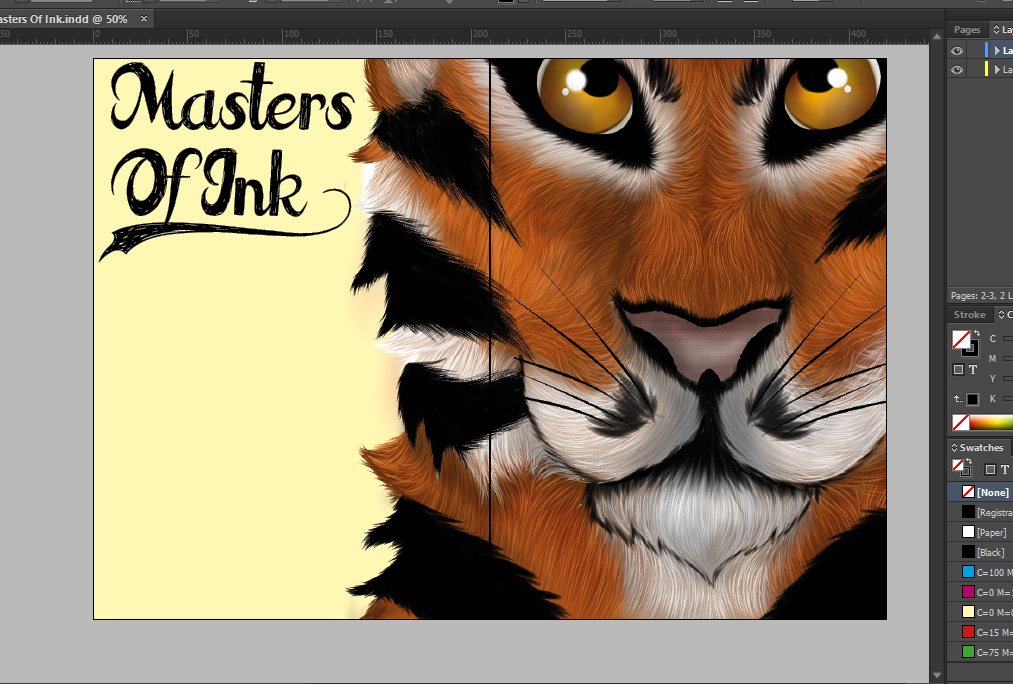
Tiger Face Work In Progress
Below is a time lapse video of the processes I went though to create my tiger design for my double page spread. In total it took around 6 - 7 hours to finish completely.
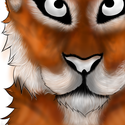
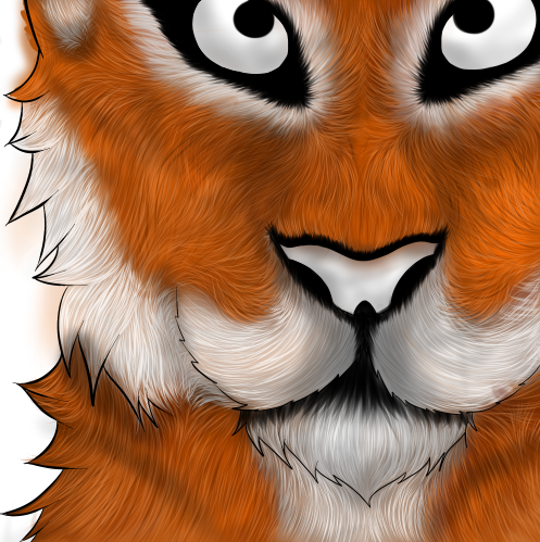
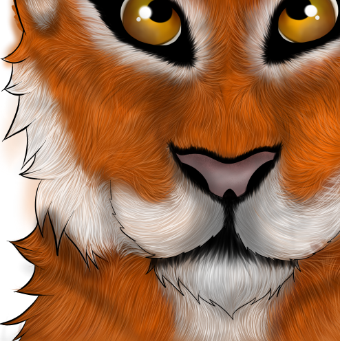
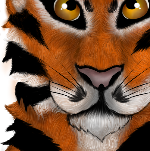
Brief Explanation
1) I firstly started by drawing out the outline and then going over my original red sketch in black. After doing this I starting on doing my base fur sketch, I did this so I could plan the direction of the fur on my tigers face. After this is started on the lightest colour which would be white. Going over the eyes, snout and tufts of fur on the tigers neck, I started to add large chunks of light grey fur, then made a layer with a lighter colour of grey draw on top of original grey and, then with a smaller brush I sketches completely white strands over the grey patches.
2) Once I'd done the white sections I started on the brown / orange parts of the tiger and started with a darker brown to a lighter brown the same way I drew the white. After this, I started doing the black stripes of fur though the tigers fur, but also added the black accented fur around it's muzzle and eyebrow areas.
3) I then stated to colour in the eyes. Creating a sphere within on a layer behind the black parts of the tiger eye, I added many different shades of orange and some green before blending them, and then adding the white spots within it's eyes.
4) Completing this I removed the outline and started sketching random tufts of fur on the outlines and the muzzle of the tiger so that it looked more realistic. After this was done I started on the process of adding shading under specific parts of fur and then onto the tigers muzzle so that it would emphasise the structure of his snout and the natural shadows which would be seen from under it's chin and tufts of fur.
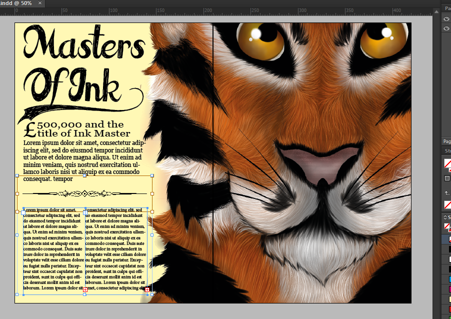
Magazine Work In Progress
I firstly started to add my drawn tiger design onto the Indesign file and then positioned it and edited the size so that it would match what I had on my drawn sketches and draft designs. After this I then went on Dafont and found a typeface which would match my drawn sketches the best I possibly could, coincidently I actually found a typeface called FatTats which seemed to match my sketches seamlessly, therefore I downloaded it, installed it onto Photoshop and Indesign and made my title which was " Masters Of Ink "

After creating my title I started to create the structure of my text and add in a selling line as an example which was " £500,000 an the title of Ink Master ". After looking at my drawn sketches and then what I was going to make for my final I realized that the designs wouldn't work properly therefore I changed my final design and added, instead of multiple different lines of confusing text, to instead add two columns of neat text an then add a divider above to give a sense division and structure.

No comments:
Post a Comment