
3 Dec 2014
26 Nov 2014
Stencil Spray Magazine Cover
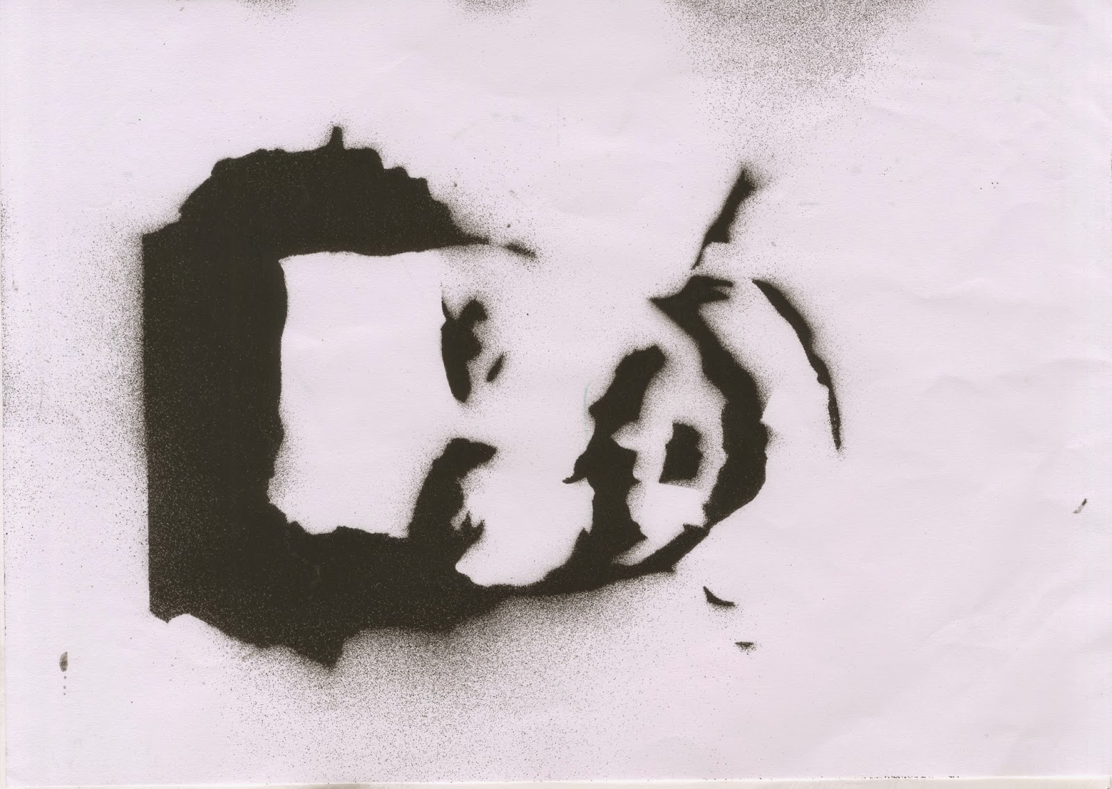
 For my stencil spray magazine cover I decided I'd use Johnny Depp as my cover model. Due to the fact I couldn't take a real picture of him I used a an image from the internet.
After downloading the image and putting it onto Photoshop I first removed the background, and then changed the Image by going to Filter > Artistic > Cutout. This changed the image so that only three different shades of grey would be used, this would allow me to be able to print out the image and cut of the different layers.
 Completely removing the background and some of Johnny shirt I cropped the area in which I wanted to print out, and then printed out each separate layer so that I could start cutting each one out.
 Starting to cut out each separate piece, the black was removed whilst the white was left to reveal different layers of Johnny Depps face. I did this wish the rest of the pieces of paper which I'd printed out, and then from this I started to fix the cut out pieces of paper to a blank piece of paper which the spray paint would eventually have Johnny Depps face sprayed onto.
 Fixing each piece of paper to each other with masking tape and then taping them onto a black board, I went outside and started to spray paint each piece of paper, keeping 30cm of distance between the spray can and the paper so that there would be minimal drips on my actual piece of paper.
This is the end result of layer 1.

This was the end result of layer 2.
This was the end result of layer 3.
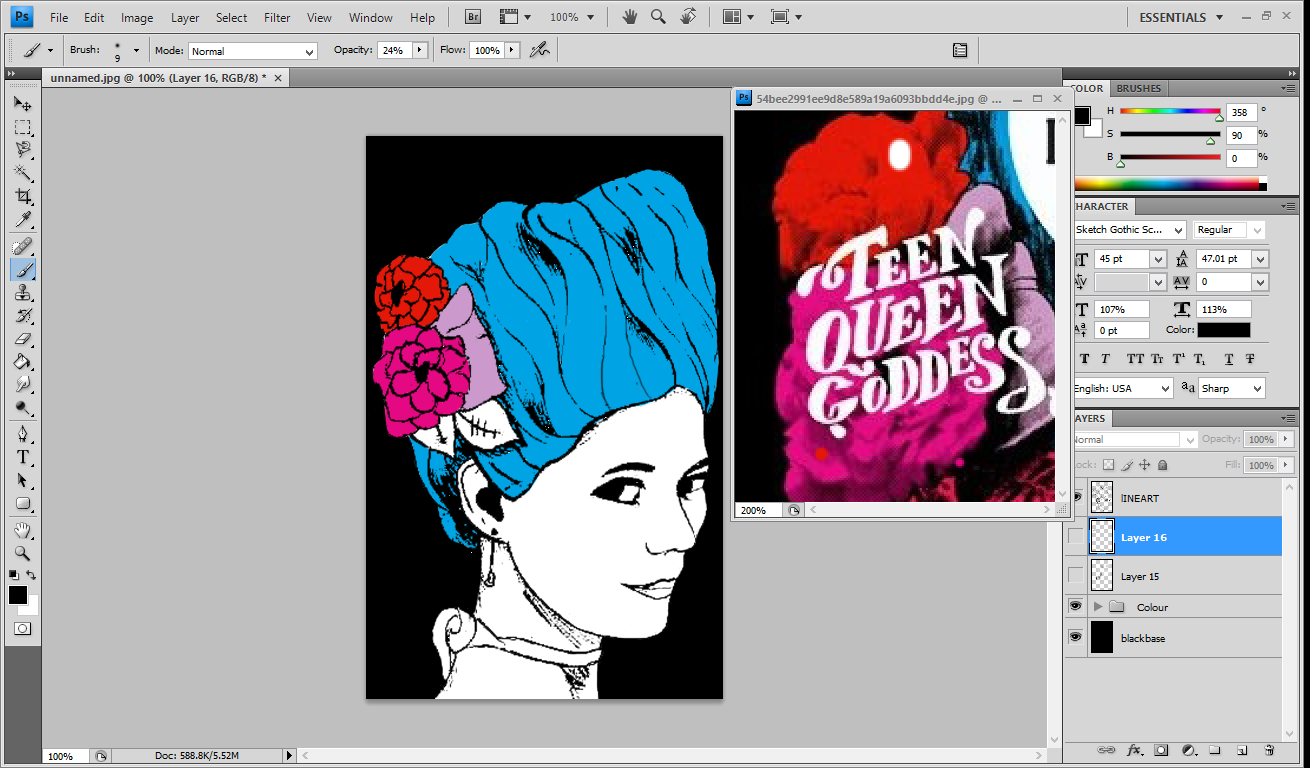
 After finishing spraying each layer I scanned each image into Photoshop and then started to add colour to each image and then merging the layers to get one final image.
  Adding an black layer around the outside of the image so that it gave a sort or border effect it actually allowed me to start adding different text boxes and writing to the magazine cover. Without this border i wouldn't have been able to see the font due to the limited colour scheme I'd chosen. Thinking of a name, and coming up with 'Jet Metal' meaning Black Metal.
After adding smaller titles to the side of the page and showing different bands at the right side, for example Slipknot, and Metallica. I positioned each one specifically so that it wouldn't cover up Johnny's face.

This is the final product.
25 Nov 2014
C.R.A.P Analysis : Kerrang Magazine
Contrast

1 - Large / Small type
2 - Patterned / Plain fill
3 - White space / Cover model
4 - White on back
5 - Large / Small character
6 - Serif typeface / San-serif typeface
Repetition
Repetition

1 - White Typeface colouration
2 - Star symbol
3 - Green desaturated typeface colouration
4 - Black stroke
5 - White sans-serif typeface
6 - Desaturated green box
Alignment

1 - Centred cover model and magazine title
2 - HIM logo and text right aligned
3 - Right aligned PLUS text and band text
4 - Free poster text and images
Proximity

1 - Masthead
2 - Cover Model
3 - Cover Line
Kerrang magazine has used contrast with type. We can see this from the use of large and small type in the HIM text and the smaller text next to it. From this we know that the larger text is more important than the smaller text, so that the ' HIM ' band title is more important than the multiple band list. There is also contrast between serif and sans-serif typefaces. On ' The Amazing Resurrection Of Ville Valo ' we can see a serif typeface has been used, but on the band list there has been sans-serif typeface which has been used. Placed on top of the magazine title the ' Life is Loud ' has been placed with a contrasting black stroke, this makes the type more legible on top of the Title.
As you can see there is a very desaturated colour pallet with black and white being used repeatedly. As well as a green desaturated typeface colouration, there is also the repetition of serif and sans-serif typefaces. Due to the type of magazine and that it's designed specifically to be darker rather than have a high saturation, the desaturated colours used works well with the magazine design.
The alignment used in this magazine is rather simplistic but also very effective. The main alignments on the Karrang magazine cover is that of a central alignment and is also asymmetrical. The main information on the page has been kept to the left, these parts as less important to the audience and due to this your eye is draw into the covers centre alignment which is an important element for the product.
At the top of the cover there is a very tight proximity between the typefaces. The masthead and selling line is also have a close proximity, and this has specifically been done so that the audiences eye is automatically drawn towards the masthead, and then to the selling line, hoping to catch the readers attention and buy the magazine to read what's inside.
14 Nov 2014
John's Awful Business Card

This was the basic business card that I was given to re-design completely so that it was more appealing to a client. Focusing on the Three C's; Concord, Conflict and Contrast, I changed the type face of each piece of text so that they would be contrasting. This would give a over-all good effect and give a client the ability to be drawn in and focus on each part of important text.
Changing the ' Awesome Comics ' to a bolder, display typeface I enhanced the contrast of the title and the general information. Also by changing the size of 'Awesome Comics' to the rest of the text it also added more contrasting features to the business card.
Changing the alignment from right to left also allowed me the ability to only have one alignment, which gave more contrast and made the card more effective. With a right alignment the ' John Panelreader ' and ' Awesome comics ' clashed and over lapped each other, and without changing the size and typeface of ' Awesome comics ' I would have had to have two different alignments which would have been concordant to each other.

After changing the design and adding a cream texture to the background, this was the final design.
13 Nov 2014


21 Oct 2014
Magazine Cover Copy Front Page - Work In Progress and Final Product
Work In Progress


This is the final sketch which I created as the photograph as a reference. Making sure to add shading in the proper places and making sure that I had copied her facial expression and accessories to the closest possibility I could. After doing this I then needed to replicate the the type face used on the magazine cover, so therefore sketched out and then coloured in the text which was meant to be bold.


Once I'd completed this I firstly scanned in both sketchbook pages and then loaded the scanned pages into Photoshop. Changing the threshold, and levels of both images I started on the colouring of each part of my sketch. Using the eyedropper tool on Photoshop I copied the colour from the original magazine colour, and then coloured in the appropriate selections on my sketch.
After giving everything a base colour I then added shading and texture in attempt to replicate my chosen magazine front cover as much as possible, moving onto my second file open in Photoshop, once the sketched text looked completely black, I removed the background before putting the selected text onto the drawn cover. Placing the text in its correct position on my copy, I changed it so that it was white, like the magazine cover I was coping and this allowed me to see the now white text against a black background.
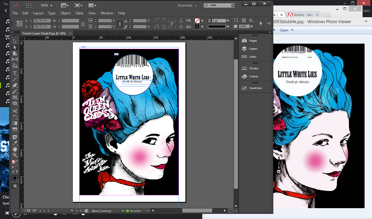
After completing the drawing, I moved the file into InDesign to complete the last part of the task. Putting a large white circle in the centre at the top of the page. I copied the text from the one magazine cover I was replicating to the one which I was making.
Final Product

20 Oct 2014
Magazine Cover Copy Double Page - Work In Progress and Final Product


Final Product

9 Oct 2014
Magazine Copy Cover - Research

For some of my research I decided that instead of only using one source I would use multiple sources to try and get the best effect and best result that I could. Therefore I decided that I would not only use Pinterest but also use Google as a source to find suitable front cover designs to copy.

After searching through Google images for an image I could use I came to the conclusion that I would be able to find one so therefore I decided to do some more research away from the internet. I went out and tried to find suitable shops in which I could take a pictures of displays and pages

After searching on google and not finding anything that I believe I could use I decided that I would also have a look on Pinterest. I put in magazine front pages and found that there was to much to chose from and examples which would be too difficult to make in the time frame which I had been given.

Once I'd searched on Pinterest for about an hour, I came across a type of magazine called Little White Lies, which conveyed and presented many different types of magazines. After searching the different covers of Little White Lies, I chose my favourite design and then pinned them to a board so that I could save the design whilst I did more research.

After searching online for examples of different types of magazine I could re-create I decided that I would not only look online but also have a look in stores at magazines which were available to buy.
Taking a few pictures of some that I found looked effective and would be somewhat easy to make but also rather challenging when it comes to Typeface positioning, and the photograph background

Collecting a few examples which not only I, but others had collect I chose the best pages out the three magazines and then photographed them. These double page spreads present the different types of font which can be used to emphasize background images and different colours.

This is a double page spread which I found which debated on created due to the fact i wouldn't have to take a picture of anything but instead i would be able to draw one side of the double page, just like the front cover which I've decided to create.

30 Sept 2014
No Staples Booklet - Printed Booklet
Final Printed Product

This is the final product of my No Staples Booklet, once I'd completed everything that I wanted too I then printed out my booklet and this was out the outcome. Even though the positioning of the guide lines in photoshop were little off or my folding of the booklet was a little off the first page still looks good from what i expected it to look like. Even though the image for this doesn't depict the proper colours that you can see with the original product which is printed out, it still show the mount of detail in which i added to each canine.

This is the first double page spread of my no staples booklet and this page shows some of the dogs I drew along with canine memorabilia. Based on the fact that only two colours were allowed and then i figured out that since black is on the grey scale I could use a lot of grey shades too. This gave a nice variety between both the canine and the memorabilia.

After thinking about which animals I'd make grey and which I'd make blue, I decided on the fact that any dog which would be a hue other than what would be on the grey scale would be blue, and any others would be grey, this also helped me show the different markings and breeds of each animal. Adding grey shades and white tints to the husky design allowed me to properly convey it's markings, on the other hand on the Golden Retriever I used a dark blue hue in order to try and show how this specific breed would be a golden colour.

Just like on my page earlier I made sure that all the breeds of dogs which could naturally have a grey hue to their pelt, I made the grey, and the others a blue. After making all the dogs I filled in the spaces with more memorabilia, which made the page look more fun and interesting.

This is the back page of my No staples booklet which could almost be the front page, I specifically wrote " The art of dogs " on the back page in order to give the feel that the page was like a blurb, and would specify what the booklet would, and of course, that is an little book filled with dogs.

When you opened the booklet you'd find a large poster style drawings. I loved making this and even though I copied the Border Collie sketch on the inside cover from my other page, this still looked amazing when I printed it out. After finishing everything I added my signature / water mark at the bottom of my piece of work.
No Staples booklet - Final designs
Final Designs

This is the final design of my first page of my no staples booklet. I'm extremely pleased with the result I obtained from this little book. After completing every sketch, colouring it and then adding all the detail, this page took me about seven hours to complete, most of which was in my free time. All the colour in this, of course was referenced from the first base colour of the whole booklet, and from this I changed the hue and made it darker or lighter for each amount of detail I was adding onto each hound and object which I drew.

This is the second page of my no staples booklet, which contained one large sketch of a Border Collie and then the blurb once more which is " The Art Of Dogs. ". Even though I copied the image of the Border Collie from the first page, I knew that this was one of my favourite pieces, and the colours blended beautifully. Even though I couldn't use a plum hue for inside the collie's mouth, instead of grey I thought it'd be a nice idea to make it blue instead, to match the colour pallet of the rest of my work. This head shot of the Collie fit perfectly onto the page which filled up the negative space which would have been left if I only put the title on the page. All together the end result of both pages turned out perfectly, and you could clearly see the amount of detail on each sketch once zoomed out.
After both sides were done, I grouped them together and then printed out the double sided piece of work.
29 Sept 2014
No Staples Booklet - Work In Progress
Work In Progress

This is the first screenshot of my no staples booklet. After finishing the pencil sketches I scanned each page into my laptop and then opened them both in photoshop. By pressing Ctrl + L, photoshop opened up the levels panel, and I was able to remove the white background but also enhance the lines colour, which were a faint grey since it was in my sketch book and make them a thick black colour.
after doing this i selected the lasso tool and started to carefully edge around the sketches i wanted and then place them onto my proper no staples template in the positions i wanted them.
Whilst doing this I tried to make sure that their wasn't a lot of empty space, and that meant trying to fill the page effectively, but not make it over crowded and make the piece of work look messy. Making sure that each new sketch was on a different layer, so that if I wanted to change anything for one sketch the rest wouldn't be altered.

On this page I then started to put the rest of my images and then make sure they were in the right position I started to colour in each dog and dog memorabilia in with the most amount of detail I could possibly add. I did all this on different layers, and then once I'd finished I started to colour on different layers, this meant that if i wanted to change the outline or change the colouring I could.

I started to completely colour each part in piece by piece and then add in the detail on yet again another layer which was placed over the top of the basic blue or grey colour and then merged down so to minimize the amount of layers I'd have with the finished product and to make sure that none of the layers would get mixed up, and get hidden by the base colours while I was changing each sketch.

Once I'd spent time creating base layers of colour and then adding different sections of black and white detail, and merging them and creating a nice effect with the smudge tool, I started to group all my coloured layers so that they wouldn't get mixed up with the outline of each sketch.
Each little sketch took me on average thirty minutes each to complete with the base colours and detail combined.

I'd decided that when colouring in the dog sketches which either had their mouth open or their eyes wide open so that we could see them properly, since i couldn't colour in the mouth with a plum hue or make the eyes brown / green I changed all the grey colours to a light blue, this in the end gave a lovely effect on each sketch and it kept to the brief that was given at the start of the task.

This is what the first completed side looks like, with all the colour and detail added to each little sketch. Once everything had been coloured I did change the position of some of the dogs, trying to space out where the grey colours were and where the blue coloured where, aiming not to get clumps of each one.

On my centre page I decided that instead of just putting picture of a dog or some memorabilia I would also put the title that was on the back of the other page. I liked the idea that this could be used on my inside over and not just the outside back page.

For the second page of my booklet I decided that I'd select one of my already made drawings and enlarge it to add more effect. I chose the Border collie because when it's enlarged it still had the effect I wanted it too, and it also fit very well under my writing " The Art Of Dogs ".
Subscribe to:
Comments (Atom)